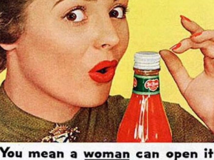
Advertising used to be a very different animal. For one, ads used to be much simpler. It wasn’t until much later that advertising companies discovered the power of using imagery and plot to manipulate our emotions. Ads were usually mere declarations of a product’s utility.

Ads also trafficked in many different themes than they do today. Classical advertising, like modern advertising, is (in)famous for preying on women’s insecurities about their looks and value as mates. Back in the day, the advertisers used explicitly sexist imagery and language.
These are a few examples of that kind of ad. Thankfully, they’re no longer in circulation.
1. ‘MEN ARE BETTER THAN WOMEN!’
This ad for Drummond sweaters is pretty stunning. “Indoors, women are useful” is almost as odious as the sentence that precedes it.
It doesn’t get much more blatant than showing a man nonchalantly hauling the weak, useless body of a female mountain climber up after him with one hand.
It’s sometimes easy to forget just how explicit sexism in advertising once was.

2. IT’S NICE TO HAVE A GIRL AROUND THE HOUSE
It’s always nice to have a girl around the house whose head you can step on. Also a girl who’s a tiger rug for some reason.
Critics have pointed out that this ad may have some kind of sexist subtext. If you look real close, you can see some clues.
Like his foot on her head. Or the fact that she’s a tiger rug.

3. THE CHEF DOES EVERYTHING
The Kenwood chef can do a lot. It can mix, it can stir, it can even mix and then stir.
But it can’t make your wife love you again after you make her wear a stupid chef’s hat in the kitchen.

