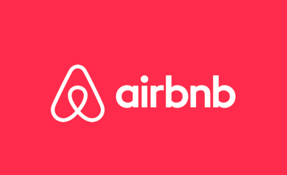
Even with having such a rough year in terms of staying afloat among the retail competition, Sears has decided to roll out a brand new logo and it looks very familiar to us. It looks just like Airbnb’s logo! Airbnb is a hospitality service where people can rent out their homes for others to stay in, perhaps as a vacation rental.
When Sears revealed its new logo on May 1st to social media, many people asked what inspired this new change and the answer was also reminiscent of that of Airbnb and their mission.

When asked what inspired their new logo, they said it “was created to represent both home and heart, this shape also conveys motion through an infinity loop, reminiscent of one embracing both home and life.”
“The rings, like those of a tree trunk, show longevity. With home and heart at the center, the rings radiate and grow to encompass our broad assortment of products and services,” the company continued.

The company adds on Twitter, “The big, the little and all of them in between. We’re here for yours, building a home and life you love. Home. Heart.”
The revealing of a new logo also follows a slogan that the company unleashed to the public last month, which was “making moments matter.” It looks like a pretty beautiful and heartwarming way to roll out a new logo!
making moments matter.
The big, the little, and all of them in between. We’re here for yours,
building a home and life you 💙. Home. Heart. @Sears. #iheartsears pic.twitter.com/P5jlT5cp8k— Sears (@Sears) May 1, 2019
In 2014, Airbnb rolled out this logo and it received a lot of backlash. Many people were suggesting the photo looked like it had NSFW (not safe for work) tendencies. Furthermore, Sears has been trying to rebrand itself, starting with the change of their logo, to create a new image for itself in the wake of several retailers filing bankruptcy (including its own company).
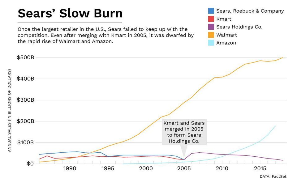
Sears was one of the biggest advertising retailers known to man. However, it has begun to lose ground as retailers like Walmart and online rivals like Amazon, and Sears’ advertising was cut down to a small fraction of what it had once been. This means the younger audience is generally not interested in buying from Sears and it’s become invisible to the audience it’s trying to retain.

Will Sears be able to turn things around and gain more traction with the new logo? Be sure to SHARE this article with your thoughts!
