Joanna Gaines runs a renovation and redecoration business. With her experiences and qualifications, she co-hosted Fixer Upper with husband Chip Gaines. Over the years, Gaines saw a lot of decor trends. Some worked better than others.
Brides Blush has a list from the designer herself. This compilation outlines everything she feels decorators should avoid in their living room. All this comes from the idea that a living room should fulfill a certain identity. There, family and guests should relax and unwind. Here’s how, according to Joanna Gaines, to keep things lively in the living room.
Joanna Gaines advises against being too bold with the decor

Creating the ideal living room means striking a delicate balance. Designer Joanna Gaines has seen some design choices she considered tacky. They include a lot of dramatic decor on the wall. Bookshelf wallpaper or just intense, neon paint give the wrong impression. But these bold statements decorators should avoid extend to the furniture too. So, don’t hang on to gold fixtures, which enjoyed popularity in the ’80s. And don’t fall into what Gaines considers a tacky decor cliche and use abstract lamps.
RELATED: Interior Designers Share The Biggest Living Room Decorating Mistakes
https://www.instagram.com/p/B-mjD6vjGwK/?utm_source=ig_web_copy_link
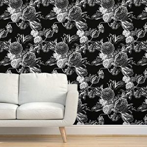
Wallpaper should be approached with caution, in general. Gaines advises against chintz wallpaper. Categorized by its floral print, chintz enjoyed as much. However, Gaines warns against using it. Today, it’s popular in New England bed and breakfasts. Also, she finds it tacky when furniture fabric exactly matches a room’s wallpaper. Living rooms should have a running theme but not one pattern it must conform to. This allows for diversity. Though, some diversity should be avoided as another decor cliche, and that includes mandala tapestries if someone isn’t a practitioner of Hinduism or Buddhism and thus understands the spiritual significance.
Be sure to look authentic, organized, classy, and finished

Finally, Gaines warns against decor cliches that detract from a living room’s purpose: comfort, relaxation, and fun. A living room should look complete and Gaines warns that plastic storage, cluttered shelves, and futons ruin this impression. Even temporary furniture should be avoided because Gaines feels it does not make the intended statement of being cool.
Do not cover the furniture with plastic and do not cover the walls with cliche decor. The latter includes mounted animal heads or bold inspirational plaques that would detract from actual photos. But if there are pictures, don’t let them be too-famous paintings. Be real and classy, so don’t embrace fake plants because they can be spotted easily. And on the quest to avoid being too bold, don’t go too far the other way and embrace a white living room. The space should look cozy and finished. What do you think about these tips? Do you agree? What styles do you think people should avoid?
